Green
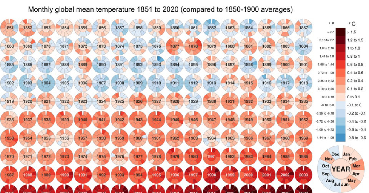
Visualized: Historical Trends in Global Monthly Surface Temperatures (1851-2020)
View the full-resolution version of this infographic
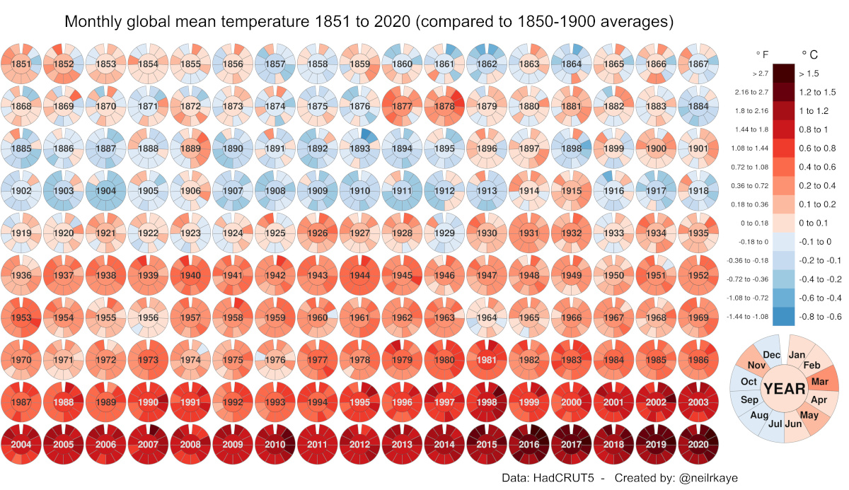
Global Temperature Graph (1851-2020)
View the high-resolution of the infographic by clicking here.
Since 1880, the Earth’s average surface temperature has risen by 0.07°C (0.13°F) every decade. That number alone may seem negligible, but over time, it adds up.
In addition, the rate of temperature change has grown significantly more dramatic over time—more than doubling to 0.18°C (0.32°F) since 1981. As a result of this global warming process, environmental crises have become the most prominent risks of our time.
In this global temperature graph, climate data scientist Neil R. Kaye breaks down how monthly average temperatures have changed over nearly 170 years. Temperature values have been benchmarked against pre-industrial averages (1850–1900).
What is Causing Global Warming?
The data visualization can be thought of in two halves, each reflecting significant trigger points in global warming trends:
- 1851-1935
Overlaps with the Second Industrial Revolution
Low-High range in global temperature increase: -0.4°C to +0.6°C - 1936-2020
Overlaps with the Third Industrial Revolution
Low-High range in global temperature increase: +0.6°C to +1.5°C and up
The global temperature graph makes it clear that for several years now, average surface temperatures have consistently surpassed 1.5°C above their pre-industrial values. Let’s dig into these time periods a bit more closely to uncover more context around this phenomenon.
Industrial Revolutions and Advances, 1851–1935
An obvious, early anomaly on the visual worth exploring occurs between 1877–1878. During this time, the world experienced numerous unprecedented climate events, from a strong El Niño to widespread droughts. The resulting Great Famine caused the deaths of between 19–50 million people, even surpassing some of the deadliest pandemics in history.
In the first five rows of the global temperature graph, several economies progressed into the Second Industrial Revolution (~1870–1914), followed by World War I (1914-1918). Overall, there was a focus on steel production and mass-produced consumer goods over these 80+ years.
Although these technological advances brought immense improvements, they came at the cost of burning fossil fuels—releasing significant amounts of carbon dioxide and other greenhouse gases. It would take several more decades before scientists realized the full extent of their accumulation in the atmosphere, and their resulting relation to global warming.
The Modern World In the Red Zone, 1936–2020
The second half of the global temperature graph is marked by World War II (1939-1945) and its aftermath. As the dust settled, nations began to build themselves back up, and things really kicked into hyperdrive with the Third Industrial Revolution.
As globalization and trade progressed following the 1950s, people and goods began moving around more than ever before. In addition, population growth peaked at 2.1% per year between 1965 and 1970. Industrialization patterns began to intensify further to meet the demands of a rising global population and our modern world.
The Importance of Historical Temperature Trends
The history of human development is intricately linked with global warming. While part of the rise in Earth’s surface temperature can be attributed to natural patterns of climate change, these historical trends shed some light on how much human activities are behind the rapid increase in global average temperatures in the last 85 years.
The following video from Reddit user bgregory98, which leverages an extensive data set published in Nature Geoscience provides a more dramatic demonstration. It looks at the escalation of global temperatures over two thousand years. In this expansive time frame, eight of the top ten hottest years on record have occurred in the last decade alone.
Global warming and climate change are some of the most pressing megatrends shaping our future. However, with the U.S. rejoining the Paris Climate Agreement, and the reduction of global carbon emissions highlighted as a key item at the World Economic Forum’s Davos Summit 2021, promising steps are being taken.


Environment
The Most Polluted Cities in the U.S.
What are the most polluted cities in the U.S. according to data from the American Lung Association’s 2024 State of the Air Report?
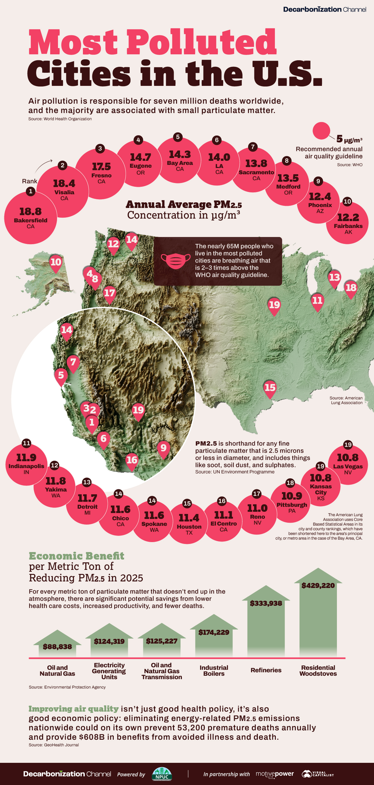
The Most Polluted U.S. Cities in 2024
According to the World Health Organization, air pollution is responsible for 7 million deaths annually, and could cost the global economy between $18–25 trillion by 2060 in annual welfare costs, or roughly 4–6% of world GDP.
And with predictions that 7 in 10 people will make their homes in urban centers by mid-century, cities are fast becoming one of the frontlines in the global effort to clear the air.
In this visualization, we use 2024 data from the State of the Air report from the American Lung Association to show the most polluted cities in the United States.
What is Air Pollution?
Air pollution is a complex mixture of gases, particles, and liquid droplets and can have a variety of sources, including wildfires and cookstoves in rural areas, and road dust and diesel exhaust in cities.
There are a few kinds of air pollution that are especially bad for human health, including ozone and carbon monoxide, but here we’re concerned with fine particulate matter that is smaller than 2.5 microns, or PM2.5 for short.
The reason for the focus is because at that small size, particulate matter can penetrate the bloodstream and cause all manner of havoc, including cardiovascular disease, lung cancer, and chronic pulmonary disease.
The American Lung Association has set an annual average guideline of 9 µg/m³ for PM2.5, however, the World Health Organization has set a much more stringent limit of 5 µg/m³.
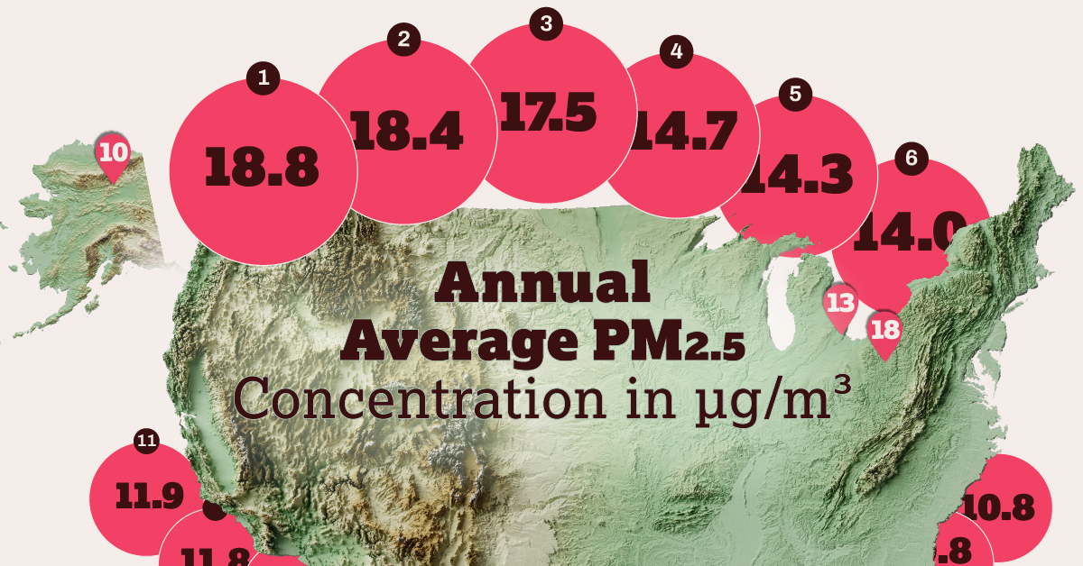
The 21 Worst Polluted Cities in the U.S.
Here are the top 21 most polluted cities in the U.S., according to their annual average PM2.5 concentrations:
| Rank | City, State | Annual average concentration, 2020-2022 (µg/m3) |
|---|---|---|
| 1 | Bakersfield, CA | 18.8 |
| 2 | Visalia, CA | 18.4 |
| 3 | Fresno, CA | 17.5 |
| 4 | Eugene, OR | 14.7 |
| 5 | Bay Area, CA | 14.3 |
| 6 | Los Angeles, CA | 14.0 |
| 7 | Sacramento, CA | 13.8 |
| 8 | Medford, OR | 13.5 |
| 9 | Phoenix, AZ | 12.4 |
| 10 | Fairbanks, AK | 12.2 |
| 11 | Indianapolis, IN | 11.9 |
| 12 | Yakima, WA | 11.8 |
| 13 | Detroit, MI | 11.7 |
| T14 | Chico, CA | 11.6 |
| T14 | Spokane, WA | 11.6 |
| 15 | Houston, TX | 11.4 |
| 16 | El Centro, CA | 11.1 |
| 17 | Reno, NV | 11.0 |
| 18 | Pittsburgh, PA | 10.9 |
| T19 | Kansas City, KS | 10.8 |
| T19 | Las Vegas, NV | 10.8 |
Note: The American Lung Association uses Core Based Statistical Areas in its city and county rankings, which have been shortened here to the area’s principal city, or metro area in the case of the Bay Area, CA.
Six of the top seven cities are in California, and four in the state’s Central Valley, a 450-mile flat valley that runs parallel to the Pacific coast, and bordered by the Coast and Sierra Nevada mountain ranges. As a result, when pollution from the big population centers on the coast is carried inland by the wind—cities #5 and #6 on the list—it tends to get trapped in the valley.
Bakersfield (#1), Visalia (#2), and Fresno (#3) are located at the drier and hotter southern end of the valley, which is worse for air quality. The top three local sources of PM2.5 emissions in 2023 were farms (20%), forest management / agricultural waste burning (20%), and road dust (14%).
Benefit to Economy
While the health impacts are generally well understood, less well known are the economic impacts.
Low air quality negatively affects worker productivity, increases absenteeism, and adds both direct and indirect health care costs. But the flip side of that equation is that improving air quality has measurable impacts to the wider economy. The EPA published a study that calculated the economic benefits of each metric ton of particulate matter that didn’t end up in the atmosphere, broken down by sector.
| Sector | Benefits per metric ton |
|---|---|
| Residential Woodstoves | $429,220 |
| Refineries | $333,938 |
| Industrial Boilers | $174,229 |
| Oil and Natural Gas Transmission | $125,227 |
| Electricity Generating Units | $124,319 |
| Oil and Natural Gas | $88,838 |
At the same time, the EPA recently updated a cost-benefit analysis of the Clean Air Act, the main piece of federal legislation governing air quality, and found that between 1990 and 2020 it cost the economy roughly $65 billion, but also provided $2 trillion in benefits.
Benefit to Business
But that’s at the macroeconomic level, so what about for individual businesses?
For one, employees like to breathe clean air and will choose to work somewhere else, given a choice. A 2022 Deloitte case study revealed that nearly 70% of highly-skilled workers said air quality was a significant factor in choosing which city to live and work in.
At the same time, air quality can impact employer-sponsored health care premiums, by reducing the overall health of the risk pool. And since insurance premiums averaged $7,590 per year in 2022 for a single employee, and rose to $21,931 for a family, that can add up fast.
Consumers are also putting their purchase decisions through a green lens, while ESG, triple-bottom-line, and impact investing are putting the environment front and center for many investors.
And if the carrot isn’t enough for some businesses, there is the stick. The EPA recently gave vehicle engine manufacturer Cummins nearly two billion reasons to help improve air quality, in a settlement the agency is calling “the largest civil penalty in the history of the Clean Air Act and the second largest environmental penalty ever.”
Learn how the National Public Utilities Council is working toward the future of sustainable electricity.

-

 Environment2 months ago
Ranked: Top Countries by Total Forest Loss Since 2001
The country with the most forest loss since 2001 lost as much forest cover as the next four countries combined.
-
 Environment3 months ago
Charted: Share of World Forests by Country
We visualize which countries have the biggest share of world forests by area—and while country size plays a factor, so too, does the environment.
-
 Environment4 months ago
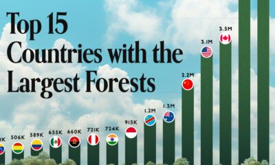
Which Countries Have the Largest Forests?
Together, the top five countries with the largest forests account for more than half of the world’s entire forest cover.
-

 Environment5 months ago
Visualized: What Lives in Your Gut Microbiome?
The human gut microbiome contains a world of microbes. We look at the the bacteria that deeply affect our health and well-being.
-
 Environment6 months ago
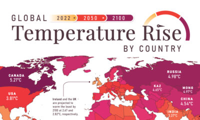
Mapped: Global Temperature Rise by Country (2022-2100P)
In this set of three maps, we show the global temperature rise on a national level for 2022, 2050, and 2100 based on an analysis by…
-
 Environment6 months ago
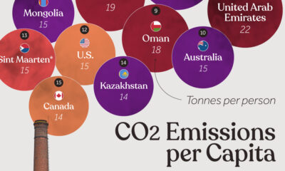
Ranked: Per Capita Carbon Emissions by Country
Which countries rank the highest in per capita carbon emissions, and how do they impact the world’s total carbon emissions?

-

 Debt1 week ago
Top 10 Countries Most in Debt to the IMF
-
 Automotive2 weeks ago
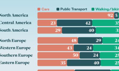
How People Get Around in America, Europe, and Asia
-
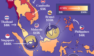
 Maps2 weeks ago
Mapped: Southeast Asia’s GDP Per Capita, by Country
-
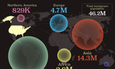
 Demographics2 weeks ago
Mapped: U.S. Immigrants by Region
-
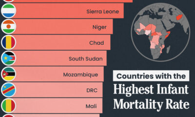
 Healthcare2 weeks ago
Which Countries Have the Highest Infant Mortality Rates?
-

 Politics2 weeks ago
Charted: How Americans Feel About Federal Government Agencies
-

 Mining2 weeks ago
Visualizing Copper Production by Country in 2023
-

 Culture2 weeks ago
How Popular Snack Brand Logos Have Changed